Visualizing Salesforce Report Data Through Charts, Graphs, and Dashboards
Overview
Salesforce is the best customer relationship management (CRM) tool for storing and managing all your organization’s data. The software easily allows you to store all types of data on constituents, donors, members, and grassroots supporters. But what if you want to visualize your and see that? Well, Salesforce has you covered with its powerful dashboard creation feature. This year, Plutus created dashboards for one of our nonprofit clients to help them better visualize and understand from a high-level their network data.
Dashboard Generation
General Displays
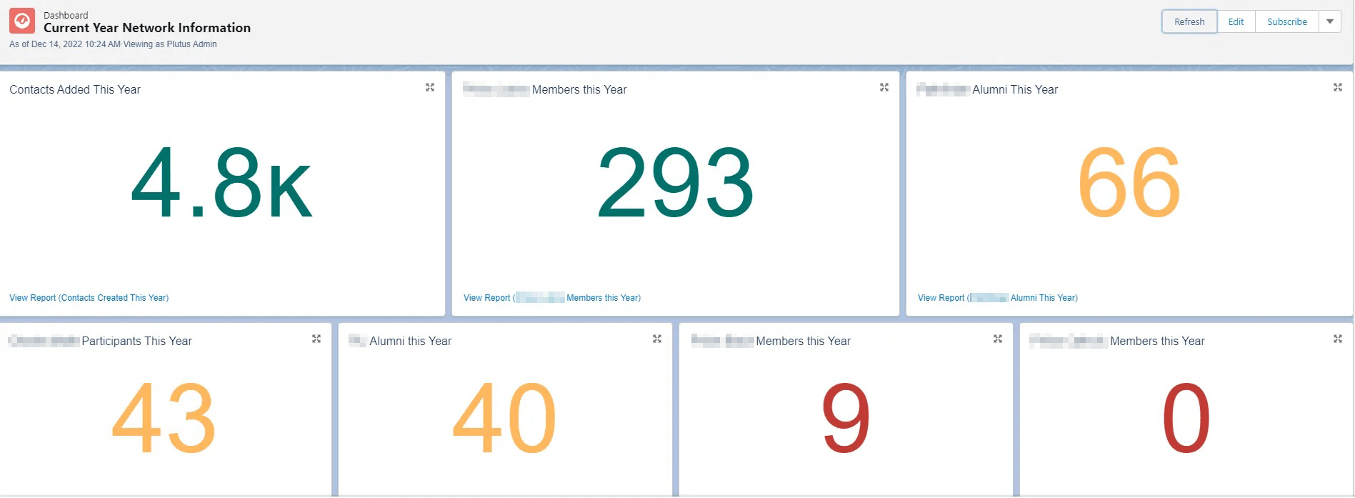
Plutus helped this nonprofit organization create a dashboard to visualize their most important network information from the past year. In this dashboard, the organization is able to clearly see the numbers of new members added, key demographics of members, and alumni added. This information selected to be displayed was specifically chosen by this group, and can be altered for whatever is important to your organization.
Salesforce also gives you the power and tools to track goals which can be set by your organization. As seen in the chart below, some of the numbers are green, yellow, and red. These colors show the organization’s progress towards its goals for certain segments of its network. As you can see below, the organization met some of its goals, nearly met others, and came up short on some. This high-level display can help executives and team leaders know how close they are to certain goals.

Charts & Graphs
Salesforce reports data can also be generated into more visual methods of displaying information like pie charts and bar graphs. The pie chart, seen below on the left, is a more in-depth breakdown of the “Contacts Created This Year” chart seen in the “General Dashboards” picture above. This chart was chosen to display the regional data of contacts created this year.
The bar chart on the right is generating an overview of event attendance for various events the organization held throughout the year. The nonprofit will use this visual aid to see its most and least popular events throughout the year. Graphs and pie charts can also be great checks on what types of data might be missing from the system.

Results
Viewing large numbers through charts, graphs, and dashboards can allow for easy data consumption and actionable insights at the click of a button. Plutus was able to easily create all of those visuals using the Salesforce Reports feature and help provide our client with useful information for internal and external stakeholders. We love projects like this – providing high-impact for our customers at a low cost. Do you need help with visualizing your Salesforce data? Reach out and get in touch!

